Tropic Like It's Hot
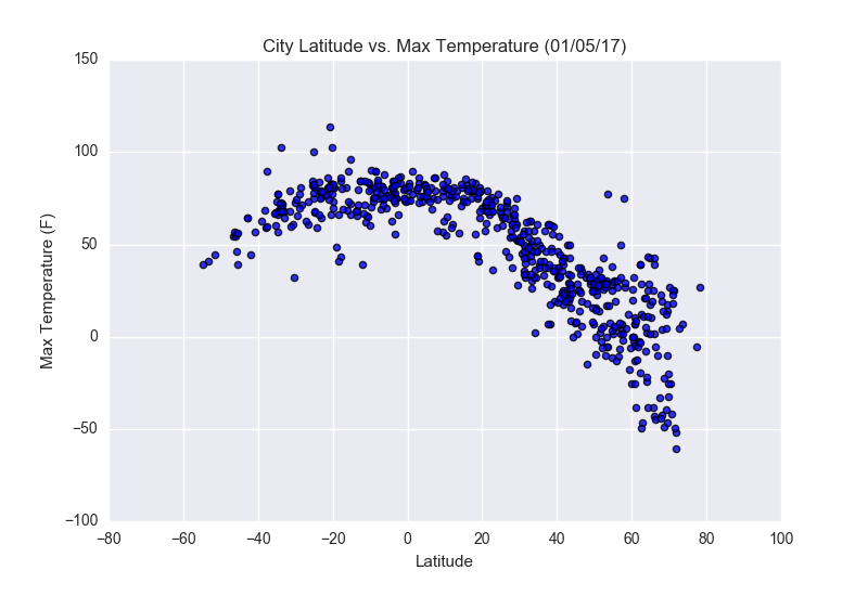
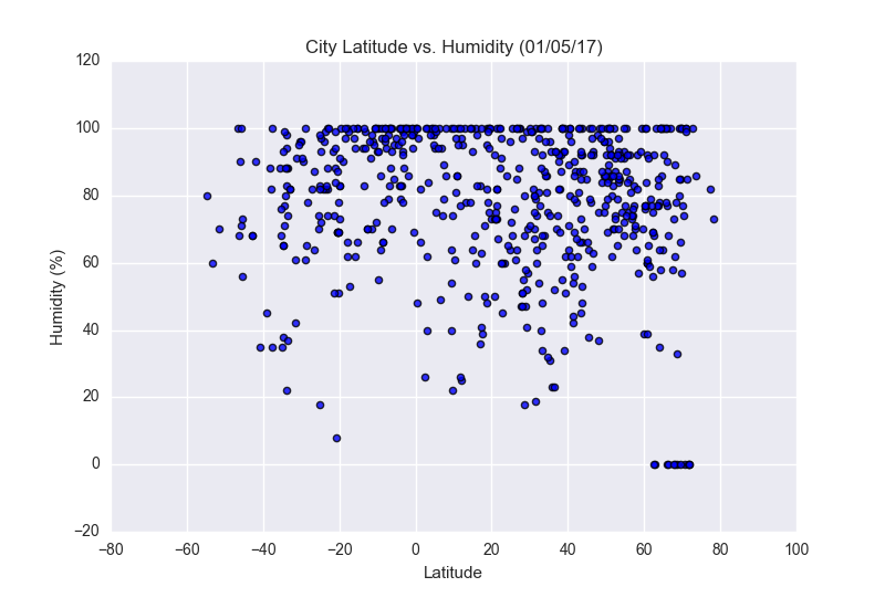
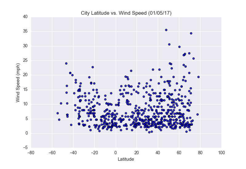
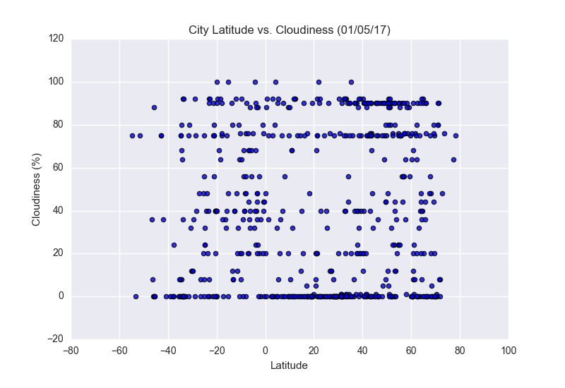
The purpose of this project is to understand the impact to weather as you move closer to the equator. To accomplish this analysis, data was pulled from the OpenWeatherMap API to produce a dataset of over 500 cities ranging in latitudes across the planet.
The data was then plotted in Matplotlib to understand correlation of different weather aspects vs. latitude. These aspects included: temperature, cloudiness, wind speed and humidity. This site provides the source data and visualizations created as part of the analysis, as well as explanations and descriptions of any trends and correlations witnessed.
Visualizations