Max Temperature Analysis
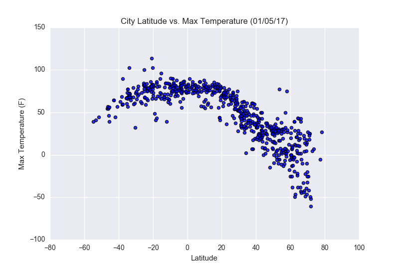
The data reflects that cities located nearest to the equator do indeed have higher max temperatures than those further away as represented by the City Latitude vs. Max Temperature scatterplot. The data also reflects that at the time the sample was taken, the Southern Hemisphere was experiencing warmer temperature to the Northern Hemisphere particularly at the more extreme latitudes.
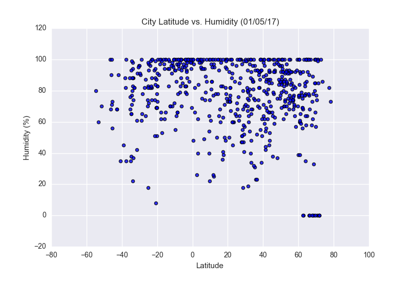
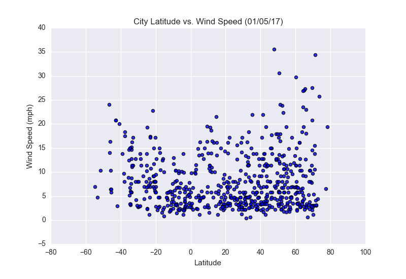
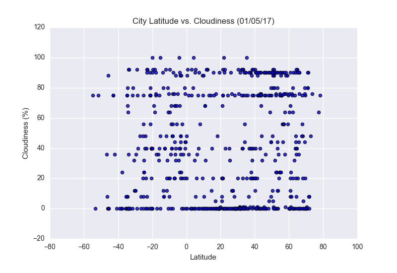
Visualizations